Well, I’ve done it. I cut the video cord last week.
My cable bill felt exorbitant – I had managed to keep getting the “new subscriber” type of deals every 12-13 months, but with Spectrum taking over, they’ve done away with that. My last reset went to $155/mo. That’s not as bad as some, but that’s for HD Video, the sports package (for my Golf Channel fix), and the rest of the “base channel package”, including the base internet package. I’d estimate I had about 125-150 watchable channels? And outside of the live sports (college football, basketball, and golf), I wasn’t watching too much. Sure, AMC and TBS/TNT replaying the same movies over and over as background noise, but I don’t have a lot of “regular” shows. I didn’t even have the DVR functionality.
With the advent of skinny bundles, I thought it might not be a bad thing. But when you start getting into it, it’s still that – a bundle. Certain channels in certain packages. And the fact that Golf Channel is a must, meant that in order to keep pricing low, my choices were limited.
With a lot of research at r/cordcutters and fomopop, I settled on Hulu w/Live TV (no commercials) plan. I also wound up setting up an antenna for the local TV. Sadly, the leaf-style antennas don’t work for me in my apartment (ground floor, facing trees, and in the wrong direction), I wound up building an antenna based on this page. It actually works pretty well, all things considered. I get about 22 channels crystal clear. What’s really cool is that Silicon Dust makes a “network tuner” – plug the antenna into it, plug in your network, quick setup, and boom, you’re going. Download the apps (FireTV, Windows, and iOS in my case), and good to go. I also subscribed to their DVR service (more of a guide, I think) for $35/year. I’m using my Ubuntu server as the local disk for the DVR.
The only issues I’m having so far is that it seems like Hulu has issues with losing video quality on the live streams – I didn’t seem to have that when I trialed it. Maybe it’s just on the sports channels? I did try YouTubeTV, and have to say that it’s a great service, but the Hulu Library is what sealed it for me. I’ll keep an eye on it over the next couple months and if it doesn’t get better, perhaps switch to YTTV. (My one complaint with YTTV is no FireTV app, which is frustrating.)
I’m interested to see how my family will handle the change when they come to visit at Thanksgiving. It’s certainly a change from the old way!
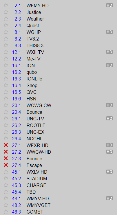
Here are the channels I receive via antenna – the ones with the red X’s are out of Roanoke – occasionally I get bounced signals that aren’t strong enough to display, but enough to program into the tuner. The X’s keep them from showing up on the apps.